
Painting with Primary Colors
Four Colors. Endless Possibilities.
Walk into an art store and look at the watercolor paints and you’ll quickly discover something: there are hundreds of colors to choose from.
Beautiful as they are, all those choices can be confusing—especially when you’re just getting started. There are warm reds and cool reds, multiple yellows, dozens of blues, convenience greens, earth colors, granulating colors, and colors with names you may have never heard before.
It’s easy to think you need a large collection of paints to create colorful, expressive paintings.
You don’t.
The Power of a Limited Palette
A surprisingly wide range of colors can be created with just a few tubes of paint. One of the best ways to learn about color is to begin with the three primary colors—yellow, red and blue—and mix the colors you need.
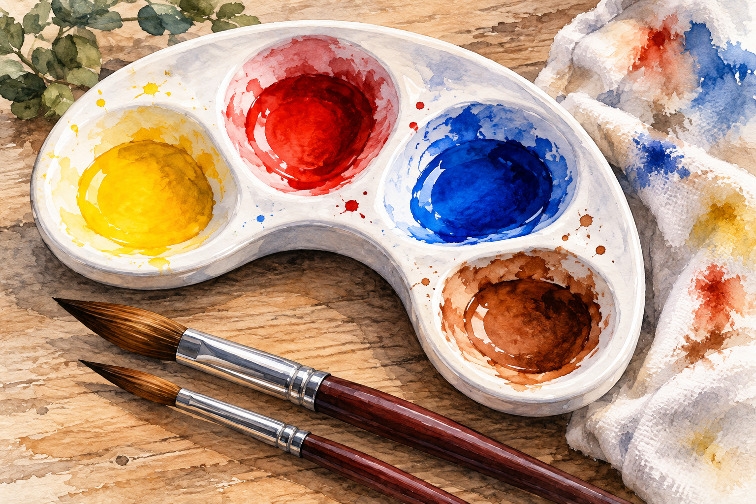
For this limited palette, I use four colors. You can certainly use other shades of the primary colors, but I’ve found these four give me a versatile range of mixing possibilities:
Hansa Yellow Light
Pyrrol Scarlet
Ultramarine Blue
Burnt Sienna
I use Daniel Smith watercolors, but you don’t need this particular brand to experiment with a limited palette. Other quality watercolor brands work well, too. The important thing is to choose a yellow, red and blue that mix cleanly, along with a warm earth color such as Burnt Sienna
With these four paints, you can create an amazing variety of bright, natural, muted and neutral colors.
Start with the Primary Colors
The basic idea is something most of us learned as children:
Yellow + Red = Orange
Yellow + Blue = Green
Red + Blue = Violet
But in watercolor, that’s only the beginning.
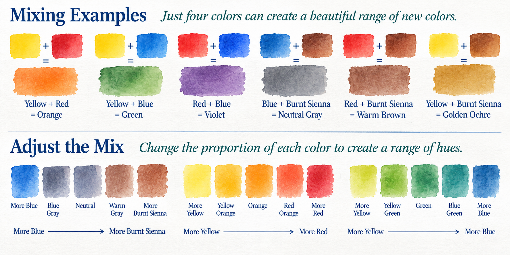
Mix Hansa Yellow Light with a small amount of Pyrrol Scarlet and you get a warm yellow-orange. Add more red and the mixture moves through orange toward a rich red-orange.
Mix Hansa Yellow Light with Ultramarine Blue and you can create everything from a bright yellow-green to a deeper blue-green simply by changing the proportions.
The same thing happens when you combine Pyrrol Scarlet and Ultramarine Blue. Changing the balance of red and blue gives you a range of violets.
There isn’t just one green, one orange or one violet. Small changes in the mixture can produce entirely different colors.
Why Add Burnt Sienna?
If the three primary colors can produce so much, why add a fourth?
Because Burnt Sienna is one of the most useful colors on my palette.
It provides warm earth tones that are especially useful for trees, barns, roads, rocks, fences and landscapes. But it becomes even more interesting when mixed with other colors.
One of my favorite combinations is:
Ultramarine Blue + Burnt Sienna
Depending on the proportions, these two paints can produce blue-grays, warm grays, rich neutrals and surprisingly dark values.
More Ultramarine Blue produces a cooler mixture. More Burnt Sienna makes it warmer.
Burnt Sienna is also useful for toning down colors that seem too bright. Mix Hansa Yellow Light and Ultramarine Blue to make a green, then add just a touch of Burnt Sienna. The green becomes softer and often looks much more like the greens we actually see in nature.
Don’t Forget Water
There’s another important ingredient in every watercolor mixture, and it doesn’t come from a tube.
Water.
A concentrated mixture can produce a rich, strong color. Add more water and that same mixture becomes lighter, softer and more transparent.
So when you experiment with mixing colors, don’t just change the proportions of the pigments. Change the amount of water, too.
You’ll discover even more possibilities.
Why Fewer Colors Can Improve a Painting
A limited palette isn’t simply a way to use fewer tubes of paint. It can actually help create a more harmonious painting.
If the sky, trees, buildings, foreground and shadows are all created from the same small family of pigments, traces of those colors naturally appear throughout the painting.
That helps everything feel connected.
It also changes the question you ask while painting.
Instead of “Which tube of green should I use?”
you begin asking:
“How can I mix the green I see?”
Learning to answer that question is one of the best ways to understand color.
Give It a Try
Set out Hansa Yellow Light, Pyrrol Scarlet, Ultramarine Blue and Burnt Sienna.
Start by mixing two colors at a time. Change the proportions and watch what happens. Then add more water and see how the same mixture changes.
Try adding just a touch of Burnt Sienna to a green. Mix Burnt Sienna with Ultramarine Blue and see how many different grays and neutrals you can create.
Don’t worry about finding the “right” color.
Explore. Mix. Observe.
You may be surprised at just how far four tubes of paint can take you.
Free Watercolor Mixing Chart
I created a Watercolor Mixing Chart to go along with this Studio Note. It shows the four-color palette, basic two-color combinations, variations created by changing the proportions, and several useful mixtures for everyday painting.
Click on image to download. Pprint it on standard 8½ × 11 paper, then keep it near your palette while you experiment.
Watercolor mixing basics - download full chart below
There are hundreds of beautiful watercolor paints available, and there’s nothing wrong with enjoying them. I certainly do.
But you don’t need hundreds of colors to make a painting.
Learning what a few colors can do—and learning to mix the colors you need—is part of becoming comfortable with watercolor.
Sometimes fewer choices on the palette give you more freedom on the paper.
Four Colors. Endless Possibilities.
Painting life one brushstroke at a time.
John Best
John Best Artistic Creations